Using Ridge, Bayesian, Lasso, Elastic Net, and OLS regression model for prediction

Introduction
Estimating the sale prices of houses is one of the basic projects to have on your Data Science CV. By finishing this article, you will be able to predict continuous variables using various types of linear regression algorithm.
Why linear regression? Linear regression is an algorithm used to predict values that are continuous in nature. It became more popular because it is the best algorithm to start with if you are a newbie to ML.
To predict the sale prices we are going to use the following linear regression algorithms: Ordinal Least Square (OLS) algorithm, Ridge regression algorithm, Lasso regression algorithm, Bayesian regression algorithm, and lastly Elastic Net regression algorithm. These algorithms can be feasibly implemented in python with the use of the scikit-learn package.
Finally, we conclude which model is best suitable for the given case by evaluating each of them using the evaluation metrics provided by the scikit-learn package.
Why Python?
Python is a general-purpose, and high-level programming language which is best known for its efficiency and powerful methods. Python is loved by data scientists because of its ease of use, which makes it more accessible. Python provides data scientists with an extensive amount of tools and packages to build machine learning models. One of its special features is that we can build various machine learning with less-code.
Steps Involved
Importing the required packages into our python environment
Importing the house price data and do some EDA on it
Data Visualization on the house price data
Feature Selection & Data Split
Modeling the data using the algorithms
Evaluating the built model using the evaluation metrics
Let’s now jump into our coding part!
Importing required packages
Our primary packages for this project are going to be pandas for data processing, NumPy to work with arrays, matplotlib & seaborn for data visualizations, and finally scikit-learn for building an evaluating our ML model. Let’s import all the required packages into our python environment.
Python Implementation:
# IMPORTING PACKAGES

import pandas as pd # data processing
import numpy as np # working with arrays
import matplotlib.pyplot as plt# visualization
import seaborn as sb # visualization
from termcolor import colored as cl # text customization

from sklearn.model_selection import train_test_split # data split        from sklearn.linear_model import LinearRegression # OLS algorithm    from sklearn.linear_model import Ridge # Ridge algorithm
from sklearn.linear_model import Lasso # Lasso algorithm
from sklearn.linear_model import BayesianRidge # Bayesian algorithm from sklearn.linear_model import ElasticNet # ElasticNet algorithm
from sklearn.metrics import explained_variance_score as evs
from sklearn.metrics import r2_score as r2

sb.set_style('whitegrid')
plt.rcParams['figure.figsize'] = (20, 10)
Importing Data & EDA
As I said before, we are going to work with the house price dataset that contains various features and information about the house and its sale price. Using the ‘read_csv’ method provided by the Pandas package, we can import the data into our python environment. After importing the data, we can use the ‘head’ method to get a glimpse of our dataset.
Python Implementation:
# IMPORTING DATA

df = pd.read_csv('house.csv')
df.set_index('Id', inplace=True)

df.head(5)
Output:

Now let’s move on to the EDA part. We begin our EDA process by removing all the null values that contain in our dataset. We can do this in python using the ‘dropna’ method.
Python Implementation:
df.dropna(inplace = True)

print(cl(df.isnull().sum(), attrs = ['bold']))
Output:
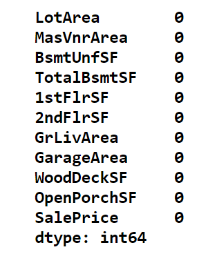
Now, using the ‘describe’ method we can get a statistical view of the data like mean, median, standard deviation, and so on.
Python Implementation:
df.describe()Output:

Our final step in the EDA process is to check the data types of the variables that are present in our variables. In case if there is any float or object type variable, we have to convert them into integer type. Now, let’s have a look at the data types of the variables present in our dataset using the ‘dtypes’ method in python.
Python Implementation:
print(cl(df.dtypes, attrs = ['bold']))Output:
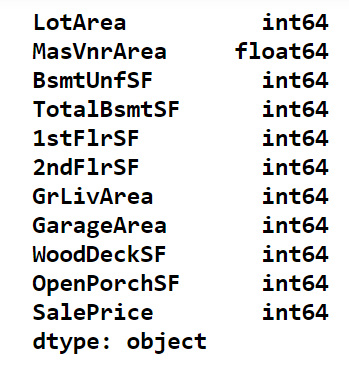
We can notice that the variable ‘MasVnrArea’ is in the form of a float data type. Remember that, it is essential to change float types to integer types because linear regression in the library supports only integer type variables. It can be converted using the ‘astype’ method in python.
Python Implementation:
df['MasVnrArea'] = pd.to_numeric(df['MasVnrArea'],errors='coerce')
df['MasVnrArea'] = df['MasVnrArea'].astype('int64')

print(cl(df.dtypes, attrs= ['bold']))
Output:
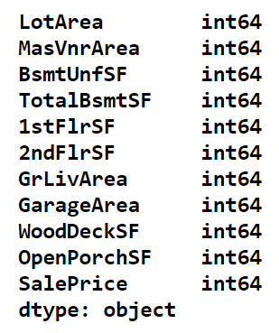
With that, our EDA process is over. Our next process is to visualize the data using the matplotlib and seaborn packages.
Data Visualization
In this process, we are going to produce three different types of charts including heatmap, scatter plot, and a distribution plot.
(i) Heatmap:
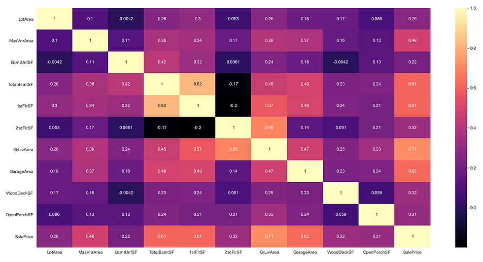
Heatmaps are very useful to find relations between two variables in a dataset. Heatmap can be easily produced using the ‘heatmap’ method provided by the seaborn package in python.
Python Implementation:
# 1. Heatmap

sb.heatmap(df.corr(), annot = True, cmap = 'magma')

plt.savefig('heatmap.png')
plt.show()
Output:
(ii) Scatter plot
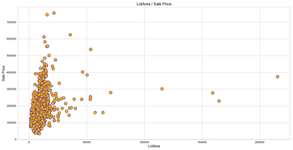
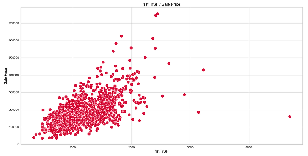
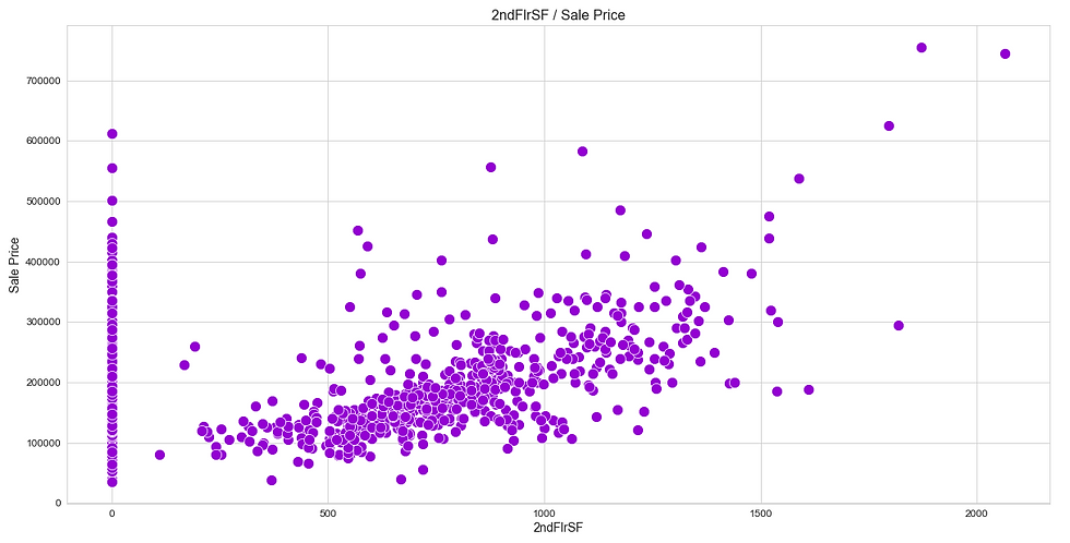
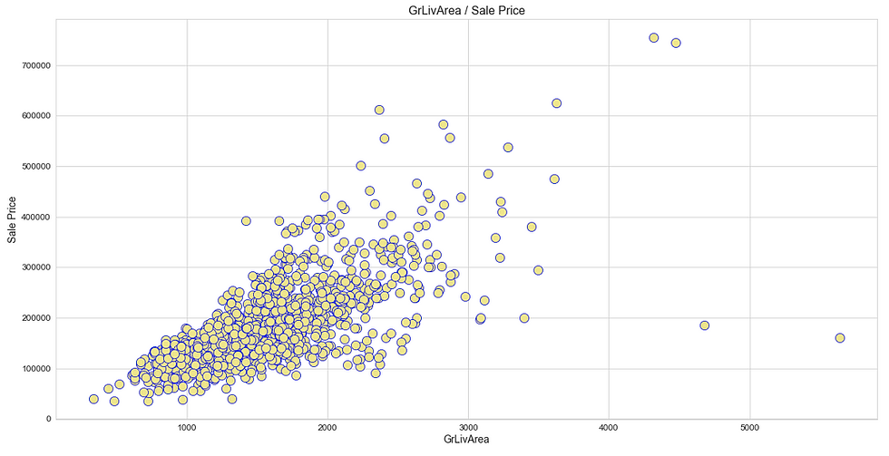
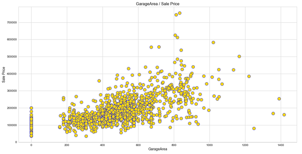
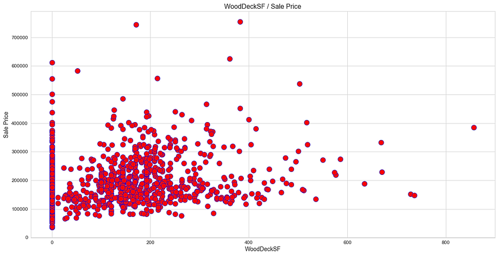
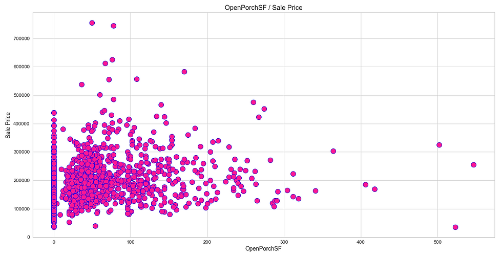
Like heatmap, a scatter plot is also used to observe linear relations between two variables in a dataset. In a scatter plot, the dependent variable is marked on the x-axis and the independent variable is marked on the y-axis. In our case, the ‘SalePrice’ attribute is the dependent variable, and every other are the independent variables. It would be difficult to produce a plot for each variable, so we can define a function that takes only the dependent variable and returns a scatter plot for every independent variable present in a dataset.
Python Implementation:
# 2. Scatter plot

def scatter_df(y_var):
    scatter_df = df.drop(y_var, axis = 1)
    i = df.columns

    plot1=sb.scatterplot(i[0],
                           y_var,
                           data = df,
                           color='orange',
                           edgecolor='b',
                           s = 150)
    plt.title('{} / Sale Price'.format(i[0]), fontsize=16)
    plt.xlabel('{}'.format(i[0]), fontsize=14)
    plt.ylabel('Sale Price', fontsize=14)
    plt.xticks(fontsize=12)
    plt.yticks(fontsize=12)
    plt.savefig('scatter1.png')
    plt.show()

    plot2=sb.scatterplot(i[1],
                         y_var,
                         data=df,
                         color='yellow',
                         edgecolor='b',
                         s=150)
    plt.title('{} / Sale Price'.format(i[1]), fontsize=16)
    plt.xlabel('{}'.format(i[1]), fontsize=14)
    plt.ylabel('Sale Price', fontsize=14)
    plt.xticks(fontsize=12)
    plt.yticks(fontsize=12)
    plt.savefig('scatter2.png')
    plt.show()

    plot3=sb.scatterplot(i[2],
                         y_var,
                         data=df,
                         color='aquamarine',
                         edgecolor='b',
                         s=150)
    plt.title('{} / Sale Price'.format(i[2]), fontsize=16)
    plt.xlabel('{}'.format(i[2]), fontsize=14)
    plt.ylabel('Sale Price', fontsize=14)
    plt.xticks(fontsize=12)
    plt.yticks(fontsize=12)
    plt.savefig('scatter3.png')
    plt.show()

    plot4=sb.scatterplot(i[3],
                         y_var,
                         data=df,
                         color='deepskyblue',
                         edgecolor='b',
                         s=150)
    plt.title('{} / Sale Price'.format(i[3]), fontsize=16)
    plt.xlabel('{}'.format(i[3]), fontsize=14)
    plt.ylabel('Sale Price', fontsize=14)
    plt.xticks(fontsize=12)
    plt.yticks(fontsize=12)
    plt.savefig('scatter4.png')
    plt.show()

    plot5=sb.scatterplot(i[4],
                         y_var,
                         data=df,
                         color='crimson',
                         edgecolor='white',
                         s=150)
    plt.title('{} / Sale Price'.format(i[4]), fontsize=16)
    plt.xlabel('{}'.format(i[4]), fontsize=14)
    plt.ylabel('Sale Price', fontsize=14)
    plt.xticks(fontsize=12)
    plt.yticks(fontsize=12)
    plt.savefig('scatter5.png')
    plt.show()

    plot6=sb.scatterplot(i[5],
                         y_var,
                         data=df,
                         color='darkviolet',
                         edgecolor='white',
                         s=150)
    plt.title('{} / Sale Price'.format(i[5]), fontsize=16)
    plt.xlabel('{}'.format(i[5]), fontsize=14)
    plt.ylabel('Sale Price', fontsize=14)
    plt.xticks(fontsize=12)
    plt.yticks(fontsize=12)
    plt.savefig('scatter6.png')
    plt.show()

    plot7=sb.scatterplot(i[6],
                         y_var,
                         data=df,
                         color='khaki',
                         edgecolor='b',
                         s=150)
    plt.title('{} / Sale Price'.format(i[6]), fontsize=16)
    plt.xlabel('{}'.format(i[6]), fontsize=14)
    plt.ylabel('Sale Price', fontsize=14)
    plt.xticks(fontsize=12)
    plt.yticks(fontsize=12)
    plt.savefig('scatter7.png')
    plt.show()

    plot8=sb.scatterplot(i[7],
                         y_var,
                         data=df,
                         color='gold',
                         edgecolor='b',
                         s=150)
    plt.title('{} / Sale Price'.format(i[7]), fontsize=16)
    plt.xlabel('{}'.format(i[7]), fontsize=14)
    plt.ylabel('Sale Price', fontsize=14)
    plt.xticks(fontsize=12)
    plt.yticks(fontsize=12)
    plt.savefig('scatter8.png')
    plt.show()

    plot9=sb.scatterplot(i[8],
                         y_var,
                         data=df,
                         color='r',
                         edgecolor='b',
                         s=150)
    plt.title('{} / Sale Price'.format(i[8]), fontsize=16)
    plt.xlabel('{}'.format(i[8]), fontsize=14)
    plt.ylabel('Sale Price', fontsize=14)
    plt.xticks(fontsize=12)
    plt.yticks(fontsize=12)
    plt.savefig('scatter9.png')
    plt.show()

    plot10=sb.scatterplot(i[9],
                         y_var,
                         data=df,
                         color='deeppink',
                         edgecolor='b',
                         s=150)
    plt.title('{} / Sale Price'.format(i[9]), fontsize=16)
    plt.xlabel('{}'.format(i[9]), fontsize=14)
    plt.ylabel('Sale Price', fontsize=14)
    plt.xticks(fontsize=12)
    plt.yticks(fontsize=12)
    plt.savefig('scatter10.png')
    plt.show()

scatter_df('SalePrice')
Output:


(iii) Distribution Plot
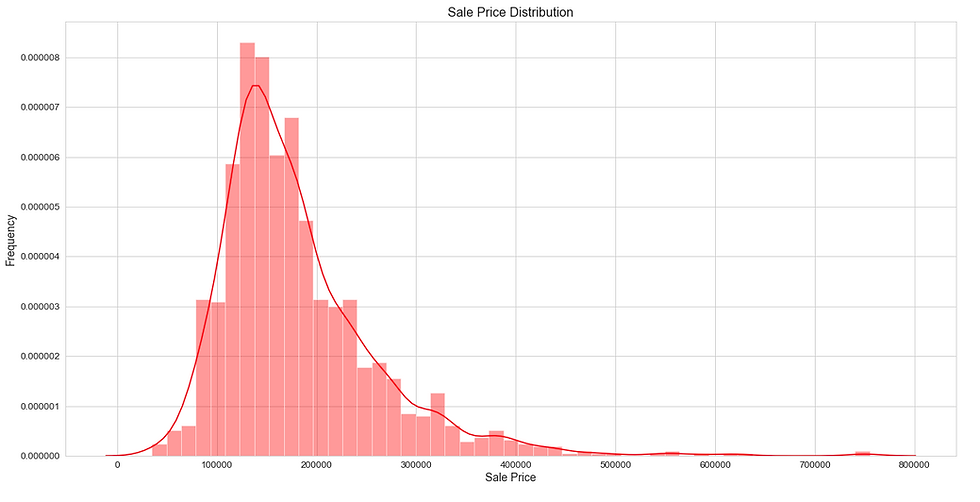
Distribution plots are very useful to check how well a variable is distributed in the dataset. Let’s now produce a distribution plot using the ‘distplot’ method to check the distribution of the ‘SalePrice’ variable in the dataset.
Python Implementation:
# 3. Distribution plot

sb.distplot(df['SalePrice'], color = 'r')
plt.title('Sale Price Distribution', fontsize = 16)
plt.xlabel('Sale Price', fontsize = 14)
plt.ylabel('Frequency', fontsize = 14)
plt.xticks(fontsize = 12)
plt.yticks(fontsize = 12)

plt.savefig('distplot.png')
plt.show()
Output:
With that, we have finished the Data Visualization process. Our next step is to select and define the dependent variables and the independent variables and split them into a train set and test set.
Feature Selection & Data Split
As I said before, in this process we are going to define the ‘X’ variable (independent variable) and the ‘Y’ variable (dependent variable). After defining the variables, we will use them to split the data into a train set and test set. Splitting the data can be done using the ‘train_test_split’ method provided by scikit-learn in python.
Python Implementation:
# FEATURE SELECTION & DATA SPLIT

X_var = df[['LotArea', 'MasVnrArea', 'BsmtUnfSF', 'TotalBsmtSF', '1stFlrSF', '2ndFlrSF', 'GrLivArea', 'GarageArea', 'WoodDeckSF', 'OpenPorchSF']].values

y_var = df['SalePrice'].values
X_train, X_test, y_train, y_test = train_test_split(X_var, y_var,
                                                    test_size = 0.2,
                                                    random_state = 0)

print(cl('X_train samples : ', attrs= ['bold']), X_train[0:5])
print(cl('X_test samples : ', attrs= ['bold']), X_test[0:5])
print(cl('y_train samples : ', attrs= ['bold']), y_train[0:5])
print(cl('y_test samples : ', attrs= ['bold']), y_test[0:5])
Output:
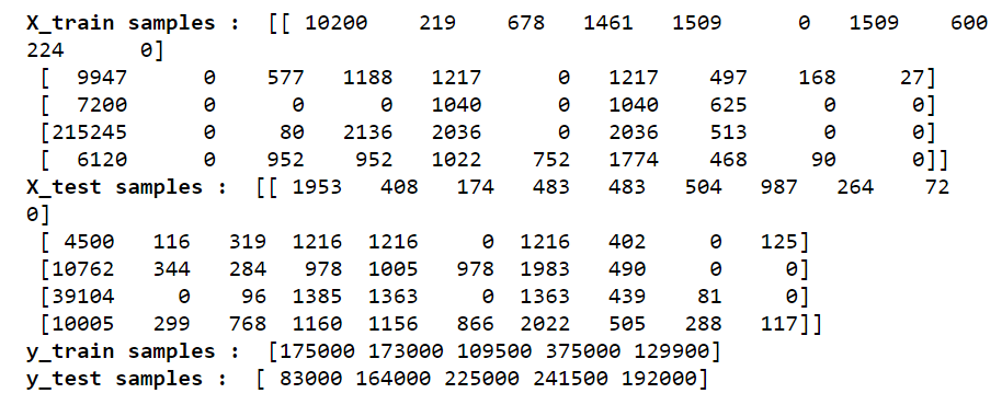
Now that we have all our required elements to build our linear regression models. So, let’s proceed to our next step which is building the model using scikit-learn in python.
Modeling
In this process, we are going to build and train five different types of linear regression models which are the OLS model, Ridge regression model, Lasso regression model, Bayesian regression model, Elastic Net regression model. For all the models, we are going to use the pre-built algorithms provided by the scikit-learn package in python. And the process for all the models are the same, first, we define a variable to store the model algorithm, next, we fit the train set variables into the model, and finally make some predictions in the test set.
Python Implementation:
# MODELING

# 1. OLS

ols = LinearRegression()
ols.fit(X_train, y_tra in)
ols_yhat = ols.predict(X_test)

# 2. Ridge

ridge = Ridge(alpha = 0.5)
ridge.fit(X_train, y_train)
ridge_yhat = ridge.predict(X_test)

# 3. Lasso

lasso = Lasso(alpha = 0.01)
lasso.fit(X_train, y_train)
lasso_yhat = lasso.predict(X_test)

# 4. Bayesian

bayesian = BayesianRidge()
bayesian.fit(X_train, y_train)
bayesian_yhat = bayesian.predict(X_test)

# 5. ElasticNet

en = ElasticNet(alpha = 0.01)
en.fit(X_train, y_train)
en_yhat = en.predict(X_test)
Using the algorithms provided by scikit-learn, we have successfully built five different linear regression models. Now, to know which model is more appropriate for our data, we can evaluate each of the models using the evaluation metrics and come to a conclusion.
Model Evaluation
To evaluate our model we are going to use the ‘explained_variance_score’ metric and the ‘r2_score’ metric methods which are provided by the scikit-learn package in python.
When it comes to the ‘explained_variance_score’ metric, the score should not below 0.60 or 60%. If it is the case, then our built model is not sufficient for our data to solve the given case. So, the ideal score of the ‘explained_variance_score’ should be between 0.60 and 1.0.
Our next evaluation metric is the ‘r2_score’ (R-squared) metric. What is R-squared? R-squared is a measurement of how well the dependent variable explains the variance of the independent variable. It is the most popular evaluation metric for regression models. The ideal ‘r2_score’ of a build should be more than 0.70 (at least > 0.60).
We are now going to compare the metric scores of each model and choose which model is more suitable for the given dataset. Let’s start with the ‘explained_variance_score’ evaluation metric in python.
Python Implementation:
# 1. Explained Variance Score

print(cl('EXPLAINED VARIANCE SCORE:', attrs= ['bold']))
print('--------------------------------------------------------------')
print(cl('Explained Variance Score of OLS model is {}'.format(evs(y_test, ols_yhat)), attrs= ['bold']))
print('--------------------------------------------------------------')
print(cl('Explained Variance Score of Ridge model is {}'.format(evs(y_test, ridge_yhat)), attrs= ['bold']))
print('--------------------------------------------------------------')
print(cl('Explained Variance Score of Lasso model is {}'.format(evs(y_test, lasso_yhat)), attrs= ['bold']))
print('--------------------------------------------------------------')
print(cl('Explained Variance Score of Bayesian model is {}'.format(evs(y_test, bayesian_yhat)), attrs= ['bold']))
print('--------------------------------------------------------------')
print(cl('Explained Variance Score of ElasticNet is {}'.format(evs(y_test, en_yhat)), attrs= ['bold']))
print('--------------------------------------------------------------')
Output:
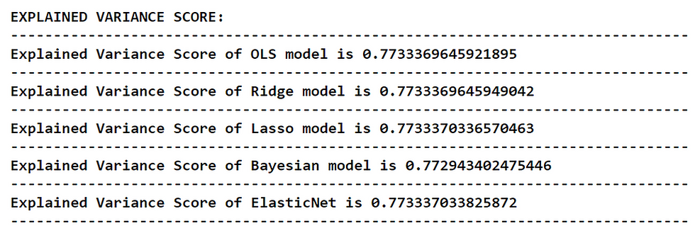
We can see that, every model while rounding the output values will result in a score of 0.77 (77%) or 0.78 (78%) which means our model performs well on our dataset and can be used to solve real-world problems. Coming to the case of choosing the best model, the Elastic Net regression model takes the place of being more accurate while comparing the other models (on the basis of Explained Variance Score). It is followed by the Lasso regression model. The worst performer among the models is the Bayesian regression model.
Now, let’s move on to the final evaluation metric which is the ‘r2_score’ metric in python.
Python Implementation:
# 2. R-squared
print(cl('R-SQUARED:', attrs= ['bold']))
print('--------------------------------------------------------------')
print(cl('R-Squared of OLS model is {}'.format(r2(y_test, ols_yhat)), attrs= ['bold']))
print('--------------------------------------------------------------')
print(cl('R-Squared of Ridge model is {}'.format(r2(y_test, ridge_yhat)), attrs= ['bold']))
print('--------------------------------------------------------------')
print(cl('R-Squared of Lasso model is {}'.format(r2(y_test, lasso_yhat)), attrs= ['bold']))
print('--------------------------------------------------------------')
print(cl('R-Squared of Bayesian model is {}'.format(r2(y_test, bayesian_yhat)), attrs= ['bold']))
print('--------------------------------------------------------------')
print(cl('R-Squared of ElasticNet is {}'.format(r2(y_test, en_yhat)), attrs= ['bold']))
print('--------------------------------------------------------------')
Output:
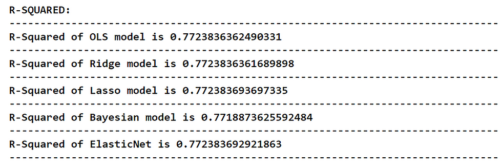
When analyzing the report, it is noted that the R-squared of the Lasso regression model is seemed to be the highest which means, it takes the place of being the most suitable model for our dataset (on the basis of R-squared). It is followed by the Elastic Net regression model. The worst performer among the models is again the Bayesian regression model so, it is more ideal to neglect the Bayesian regression model for our dataset.
We can conclude that both Lasso and Elastic Net regression models can be used for our house price dataset.
That’s it!
Final Thoughts!
After going through a bunch of processes, we have successfully built and evaluated five different types of linear regression models in python also, choosing the best model for our given dataset. But, this won’t stop here. Each and every model we built have their own statistical and mathematical concepts. The reason why we have chosen these five models is because of its popularity. There are also many other different linear regression models like the Poisson regression model, Boosted decision tree model, Decision tree model, and so on.
Even though linear regression is the most basic concept in machine learning, it is yet powerful to build models.
With that, we come to the end of this article. If you forget any of the coding parts, don’t worry, I’ve provided the full code for all the processes we have gone through at the end of this article.
Happy Machine Learning!
Full code:
# IMPORTING PACKAGES

import pandas as pd # data processing
import numpy as np # working with arrays
import matplotlib.pyplot as plt# visualization
import seaborn as sb # visualization
from termcolor import colored as cl # text customization

from sklearn.model_selection import train_test_split # data split        from sklearn.linear_model import LinearRegression # OLS algorithm    from sklearn.linear_model import Ridge # Ridge algorithm
from sklearn.linear_model import Lasso # Lasso algorithm
from sklearn.linear_model import BayesianRidge # Bayesian algorithm from sklearn.linear_model import ElasticNet # ElasticNet algorithm
from sklearn.metrics import explained_variance_score as evs
from sklearn.metrics import r2_score as r2

sb.set_style('whitegrid')
plt.rcParams['figure.figsize'] = (20, 10)

# IMPORTING DATA

df = pd.read_csv('house.csv')
df.set_index('Id', inplace=True)

print(df.head(5))

df.dropna(inplace = True)

print(cl(df.isnull().sum(), attrs = ['bold']))

df.describe()

print(cl(df.dtypes, attrs = ['bold']))

df['MasVnrArea'] = pd.to_numeric(df['MasVnrArea'],errors='coerce')
df['MasVnrArea'] = df['MasVnrArea'].astype('int64')

print(cl(df.dtypes, attrs= ['bold']))

# 1. Heatmap

sb.heatmap(df.corr(), annot = True, cmap = 'magma')

plt.savefig('heatmap.png')
plt.show()

# 2. Scatter plot

def scatter_df(y_var):
    scatter_df = df.drop(y_var, axis = 1)
    i = df.columns

    plot1=sb.scatterplot(i[0],
                           y_var,
                           data = df,
                           color='orange',
                           edgecolor='b',
                           s = 150)
    plt.title('{} / Sale Price'.format(i[0]), fontsize=16)
    plt.xlabel('{}'.format(i[0]), fontsize=14)
    plt.ylabel('Sale Price', fontsize=14)
    plt.xticks(fontsize=12)
    plt.yticks(fontsize=12)
    plt.savefig('scatter1.png')
    plt.show()

    plot2=sb.scatterplot(i[1],
                         y_var,
                         data=df,
                         color='yellow',
                         edgecolor='b',
                         s=150)
    plt.title('{} / Sale Price'.format(i[1]), fontsize=16)
    plt.xlabel('{}'.format(i[1]), fontsize=14)
    plt.ylabel('Sale Price', fontsize=14)
    plt.xticks(fontsize=12)
    plt.yticks(fontsize=12)
    plt.savefig('scatter2.png')
    plt.show()

    plot3=sb.scatterplot(i[2],
                         y_var,
                         data=df,
                         color='aquamarine',
                         edgecolor='b',
                         s=150)
    plt.title('{} / Sale Price'.format(i[2]), fontsize=16)
    plt.xlabel('{}'.format(i[2]), fontsize=14)
    plt.ylabel('Sale Price', fontsize=14)
    plt.xticks(fontsize=12)
    plt.yticks(fontsize=12)
    plt.savefig('scatter3.png')
    plt.show()

    plot4=sb.scatterplot(i[3],
                         y_var,
                         data=df,
                         color='deepskyblue',
                         edgecolor='b',
                         s=150)
    plt.title('{} / Sale Price'.format(i[3]), fontsize=16)
    plt.xlabel('{}'.format(i[3]), fontsize=14)
    plt.ylabel('Sale Price', fontsize=14)
    plt.xticks(fontsize=12)
    plt.yticks(fontsize=12)
    plt.savefig('scatter4.png')
    plt.show()

    plot5=sb.scatterplot(i[4],
                         y_var,
                         data=df,
                         color='crimson',
                         edgecolor='white',
                         s=150)
    plt.title('{} / Sale Price'.format(i[4]), fontsize=16)
    plt.xlabel('{}'.format(i[4]), fontsize=14)
    plt.ylabel('Sale Price', fontsize=14)
    plt.xticks(fontsize=12)
    plt.yticks(fontsize=12)
    plt.savefig('scatter5.png')
    plt.show()

    plot6=sb.scatterplot(i[5],
                         y_var,
                         data=df,
                         color='darkviolet',
                         edgecolor='white',
                         s=150)
    plt.title('{} / Sale Price'.format(i[5]), fontsize=16)
    plt.xlabel('{}'.format(i[5]), fontsize=14)
    plt.ylabel('Sale Price', fontsize=14)
    plt.xticks(fontsize=12)
    plt.yticks(fontsize=12)
    plt.savefig('scatter6.png')
    plt.show()

    plot7=sb.scatterplot(i[6],
                         y_var,
                         data=df,
                         color='khaki',
                         edgecolor='b',
                         s=150)
    plt.title('{} / Sale Price'.format(i[6]), fontsize=16)
    plt.xlabel('{}'.format(i[6]), fontsize=14)
    plt.ylabel('Sale Price', fontsize=14)
    plt.xticks(fontsize=12)
    plt.yticks(fontsize=12)
    plt.savefig('scatter7.png')
    plt.show()

    plot8=sb.scatterplot(i[7],
                         y_var,
                         data=df,
                         color='gold',
                         edgecolor='b',
                         s=150)
    plt.title('{} / Sale Price'.format(i[7]), fontsize=16)
    plt.xlabel('{}'.format(i[7]), fontsize=14)
    plt.ylabel('Sale Price', fontsize=14)
    plt.xticks(fontsize=12)
    plt.yticks(fontsize=12)
    plt.savefig('scatter8.png')
    plt.show()

    plot9=sb.scatterplot(i[8],
                         y_var,
                         data=df,
                         color='r',
                         edgecolor='b',
                         s=150)
    plt.title('{} / Sale Price'.format(i[8]), fontsize=16)
    plt.xlabel('{}'.format(i[8]), fontsize=14)
    plt.ylabel('Sale Price', fontsize=14)
    plt.xticks(fontsize=12)
    plt.yticks(fontsize=12)
    plt.savefig('scatter9.png')
    plt.show()

    plot10=sb.scatterplot(i[9],
                         y_var,
                         data=df,
                         color='deeppink',
                         edgecolor='b',
                         s=150)
    plt.title('{} / Sale Price'.format(i[9]), fontsize=16)
    plt.xlabel('{}'.format(i[9]), fontsize=14)
    plt.ylabel('Sale Price', fontsize=14)
    plt.xticks(fontsize=12)
    plt.yticks(fontsize=12)
    plt.savefig('scatter10.png')
    plt.show()

scatter_df('SalePrice')

# 3. Distribution plot

sb.distplot(df['SalePrice'], color = 'r')
plt.title('Sale Price Distribution', fontsize = 16)
plt.xlabel('Sale Price', fontsize = 14)
plt.ylabel('Frequency', fontsize = 14)
plt.xticks(fontsize = 12)
plt.yticks(fontsize = 12)

plt.savefig('distplot.png')
plt.show()

# FEATURE SELECTION & DATA SPLIT

X_var = df[['LotArea', 'MasVnrArea', 'BsmtUnfSF', 'TotalBsmtSF', '1stFlrSF', '2ndFlrSF', 'GrLivArea', 'GarageArea', 'WoodDeckSF', 'OpenPorchSF']].values

y_var = df['SalePrice'].values
X_train, X_test, y_train, y_test = train_test_split(X_var, y_var,
                                                    test_size = 0.2,
                                                    random_state = 0)

print(cl('X_train samples : ', attrs= ['bold']), X_train[0:5])
print(cl('X_test samples : ', attrs= ['bold']), X_test[0:5])
print(cl('y_train samples : ', attrs= ['bold']), y_train[0:5])
print(cl('y_test samples : ', attrs= ['bold']), y_test[0:5])

# MODELING

# 1. OLS

ols = LinearRegression()
ols.fit(X_train, y_tra in)
ols_yhat = ols.predict(X_test)

# 2. Ridge

ridge = Ridge(alpha = 0.5)
ridge.fit(X_train, y_train)
ridge_yhat = ridge.predict(X_test)

# 3. Lasso

lasso = Lasso(alpha = 0.01)
lasso.fit(X_train, y_train)
lasso_yhat = lasso.predict(X_test)

# 4. Bayesian

bayesian = BayesianRidge()
bayesian.fit(X_train, y_train)
bayesian_yhat = bayesian.predict(X_test)

# 5. ElasticNet

en = ElasticNet(alpha = 0.01)
en.fit(X_train, y_train)
en_yhat = en.predict(X_test)

# EVALUATION

print(cl('EXPLAINED VARIANCE SCORE:', attrs = ['bold']))
print('--------------------------------------------------------------')
print(cl('Explained Variance Score of OLS model is {}'.format(evs(y_test, ols_yhat)), attrs = ['bold']))
print('--------------------------------------------------------------')
print(cl('Explained Variance Score of Ridge model is {}'.format(evs(y_test, ridge_yhat)), attrs = ['bold']))
print('--------------------------------------------------------------')
print(cl('Explained Variance Score of Lasso model is {}'.format(evs(y_test, lasso_yhat)), attrs = ['bold']))
print('--------------------------------------------------------------')
print(cl('Explained Variance Score of Bayesian model is {}'.format(evs(y_test, bayesian_yhat)), attrs = ['bold']))
print('--------------------------------------------------------------')
print(cl('Explained Variance Score of ElasticNet is {}'.format(evs(y_test, en_yhat)), attrs = ['bold']))
print('--------------------------------------------------------------')

# 2. R-squared

print(cl('R-SQUARED:', attrs = ['bold']))
print('--------------------------------------------------------------')
print(cl('R-Squared of OLS model is {}'.format(r2(y_test, ols_yhat)), attrs = ['bold']))
print('--------------------------------------------------------------')
print(cl('R-Squared of Ridge model is {}'.format(r2(y_test, ridge_yhat)), attrs = ['bold']))
print('--------------------------------------------------------------')
print(cl('R-Squared of Lasso model is {}'.format(r2(y_test, lasso_yhat)), attrs = ['bold']))
print('--------------------------------------------------------------')
print(cl('R-Squared of Bayesian model is {}'.format(r2(y_test, bayesian_yhat)), attrs = ['bold']))
print('--------------------------------------------------------------')
print(cl('R-Squared of ElasticNet is {}'.format(r2(y_test, en_yhat)), attrs = ['bold']))
print('--------------------------------------------------------------')
could you please provide this data (.csv file link) ?
Wonderful and detailed article.
In Python or any OOP language, we don't call as 'function'. We call as 'method'. People will get confused. Modify if required/possible.
Guess, you become very fluent in Python. Good
Good Nikhil